


An ecommerce website can look polished and still make buying unnecessarily difficult. In 2020, as more consumers shop from mobile devices and compare products across multiple stores, effective ecommerce website design needs to do more than present attractive product pages. It should help customers understand what is being sold, evaluate their options, trust the business, and complete a purchase without unnecessary effort.
Instead of treating design as a collection of colors, banners, and page layouts, businesses should look at the decisions that shape the entire shopping journey. The following five areas deserve particular attention because they influence how easily customers can move from arriving on a website to confidently completing an order.
1. Design the product discovery process around how customers actually shop
Many ecommerce websites organize products according to internal business structures. Categories may reflect inventory systems, supplier relationships, or company terminology rather than the way customers naturally search for products.
This creates friction before customers even reach a product page.
Effective product discovery begins with understanding the different ways people shop. Some customers arrive knowing exactly what they want and immediately use the search bar. Others browse categories, compare similar products, apply filters, or move between product pages before making a decision.
The website should support all of these behaviors.
Category names should be immediately understandable. Filters should reflect meaningful product characteristics, such as size, price, material, compatibility, brand, or intended use. Breadcrumb navigation should help visitors understand where they are within the website and return to broader categories without restarting their search.
Site search also deserves careful attention. Search tools should account for common spelling errors, product variations, synonyms, and model numbers where relevant.
Businesses working with an ecommerce website development company should discuss product discovery early in the development process rather than treating navigation and filtering as features that can be added after the website structure has already been finalized.
A useful test is simple: ask someone unfamiliar with the website to find three specific products. Observe where they hesitate, which terms confuse them, and how many steps are required. Those observations often reveal usability problems that analytics alone cannot explain.
2. Use ecommerce website design to reduce uncertainty on product pages
Customers cannot physically inspect products when shopping online. Product pages therefore need to answer the questions that would normally be resolved by seeing, touching, comparing, or discussing a product in person.
A common mistake is to treat product pages primarily as sales pages. Excessive promotional language often provides less value than practical information.
Strong product pages explain dimensions, materials, features, compatibility, expected uses, limitations, shipping conditions, return policies, and other information relevant to the purchase.
Product photography should also help customers evaluate products rather than simply make pages look attractive. Multiple angles, close-up images, contextual photographs, and product videos can provide information that descriptions cannot communicate efficiently.
Businesses should consider the questions customers ask before and after purchasing. If the customer service team repeatedly receives questions about sizing, installation, compatibility, delivery, or product care, those answers should probably appear on the relevant product pages.
Reviews can further reduce uncertainty when they contain useful details from verified customers. Allowing reviewers to mention characteristics such as size purchased, intended use, or experience level can make reviews more valuable to prospective buyers.
An experienced ecommerce web development company can help businesses structure product templates so that important information remains consistent across large catalogs without forcing every product into an identical presentation.
The objective is not to add as much information as possible. It is to provide the information customers need to make informed decisions.
3. Treat mobile shopping as a different behavior, not a smaller screen
Responsive design has become standard, but a website that technically adjusts to smaller screens is not necessarily easy to shop from.
Mobile users interact with websites differently. They navigate with their fingers, may have slower connections, switch between applications, and often shop in environments where distractions are common.
For this reason, mobile ecommerce design should prioritize clarity and ease of interaction.
Buttons and links need sufficient spacing. Product images should load efficiently without sacrificing usefulness. Filters should be easy to open, apply, and remove. Forms should request only necessary information and use appropriate mobile keyboards for phone numbers, email addresses, and payment details.
Businesses should also examine whether important information becomes difficult to find on smaller screens. Shipping costs, product variations, return conditions, and stock availability should not disappear behind confusing menus or excessive scrolling.
Page speed is especially important. Large images, unnecessary scripts, poorly configured plugins, and third-party applications can slow down mobile experiences.
Performance should therefore be considered during development rather than addressed only after launch. A capable ecommerce software development company can evaluate how platform architecture, integrations, custom functionality, and frontend resources affect website performance across devices.
4. Make the path to purchase predictable
Customers should not have to learn how an ecommerce website works.
Familiar patterns exist for a reason. Shoppers generally expect the cart icon to be easy to locate, product availability to be clear, checkout steps to follow a logical sequence, and errors to explain exactly what needs to be corrected.
Unnecessary surprises can increase abandonment.
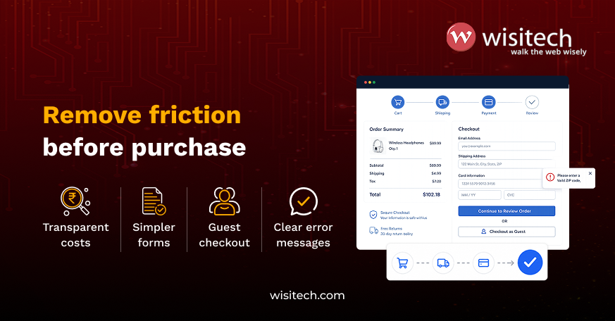
Unexpected shipping charges are a common example. Businesses may not always be able to calculate exact delivery costs before checkout, but providing shipping information earlier can help customers understand what to expect.
Account creation is another potential obstacle. Requiring customers to create an account before purchasing may discourage first-time buyers who want to complete an order quickly. Guest checkout can reduce this barrier while still allowing customers to create an account after purchasing.
Forms should also be reviewed carefully. Every additional field increases the amount of work required to complete an order. Businesses should ask whether each field is necessary for payment, fulfillment, communication, or legal requirements.
Error messages should identify the problem and explain how to correct it. A message such as “invalid input” is less useful than explaining that a postal code contains an unsupported format or a required field has been left empty.
A predictable checkout experience does not need to be visually exciting. It needs to help customers finish what they came to do.
5. Build ecommerce website design around measurement and continuous improvement
Launching an ecommerce website should be the beginning of the design process, not the end.
Customer behavior changes, product catalogs expand, marketing channels evolve, and website features that initially worked well can become obstacles over time.
Businesses should establish a process for identifying and improving these issues.
Analytics can reveal where customers leave the website, which product pages receive traffic but generate few purchases, which search terms produce no results, and whether mobile customers behave differently from desktop users.
However, numbers alone do not always explain why problems occur.
Usability testing, customer support conversations, search data, surveys, session recordings, and checkout feedback can provide additional context. Combining quantitative and qualitative information allows businesses to make more informed design decisions.
Testing should focus on meaningful questions. Instead of changing button colors without a clear reason, businesses can investigate whether customers understand shipping policies, whether filters help shoppers narrow large catalogs, or whether important product information appears at the right stage of the buying process.
Improvements should also be prioritized according to potential customer impact. Fixing a confusing checkout form used by thousands of customers may provide greater value than redesigning a low-traffic informational page.
Building an ecommerce experience customers can trust
Successful ecommerce websites are built around customer decisions rather than visual trends alone. Product discovery, product information, mobile usability, predictable purchasing processes, and continuous improvement all contribute to a shopping experience that helps customers evaluate products and complete transactions with confidence.
For businesses reviewing their ecommerce website design in 2020, the most useful starting point is to identify where customers struggle, abandon purchases, or repeatedly ask for additional information and address those problems before investing in cosmetic redesigns.
Send us your website URL and the three ecommerce pages with the highest traffic, and our team will help you identify which design and usability issues should be prioritized first.