
Responsive Web Design is all about creating web pages that look good on all devices
The days of designing a website for a single desktop are really over. The expansion of smartphone technology is pushing web designers to re-think how their work can be displayed across various platforms. It is really important to have one design for desktop, another for Android, iPhone, Kindle, and all screen resolutions should be compatible too. In the coming few years, we might need to design for more additional inventions.
Responsive Web Design in A Nutshell
Always remember that Responsive Web Design is the Mantra for a successful website today. Simply put, responsive web design ensures that your website offers an equally outstanding user experience to people on smartphones and desktop. Well, it’s worth your while as it satisfies the SEO need and customer demand brilliantly that search engines like Google absolutely like.
This practice consists of a blend of flexible grids, layouts, images, and smart use of CSS (Cascading Style Sheets) media queries. As the user switches from their computer to smartphone, the website should automatically switch to support the resolution, image size, and scripting abilities.
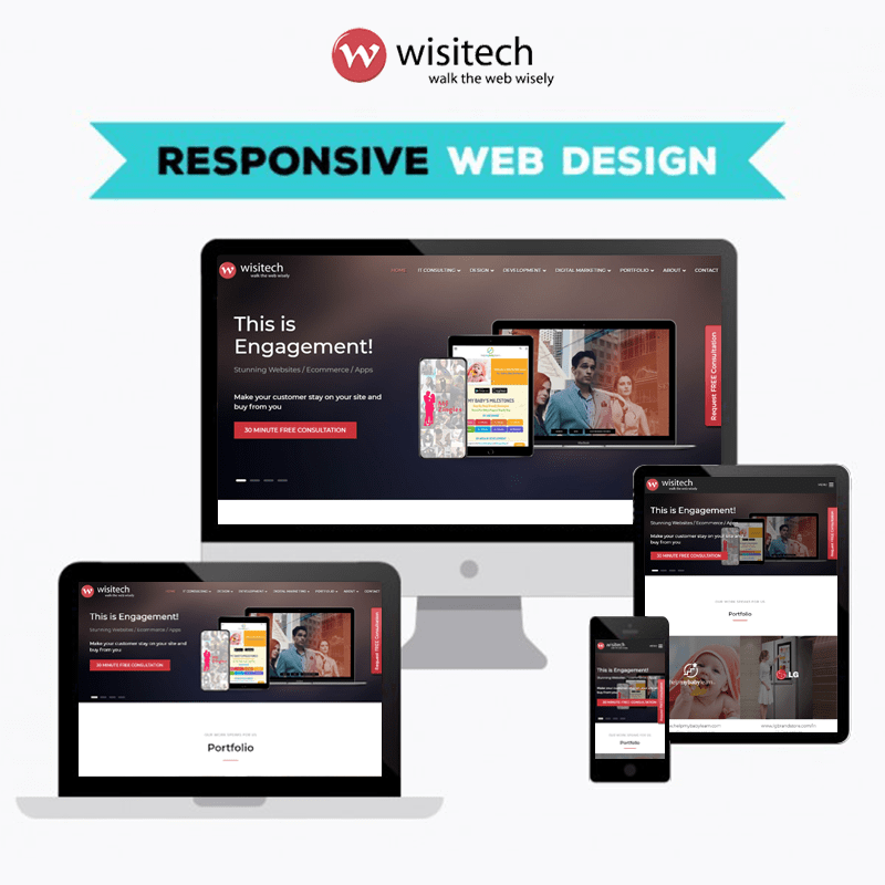
Checking if your website has a mobile responsive design or not is really easy. You can check that by resizing your browser window. Before further explanation, let’s take a look at Wisitech’s mobile-friendly responsive website: looking at the site, you will notice that the content scales up or down as per the size of your window.
Mainly, it means that this Wisitech website can be viewed with any device and will always make full use of the size of your screen. Whether the screen is big or small, the content is always optimized for relevant screen resolution. This constructively abolishes unnecessary resizing, scrolling and panning, when someone is visiting your favorite site with different devices.
Why is Responsive Web Design So Important?
Designing various versions of websites to work with every possible device out there, the process just wouldn’t be practical and would be terribly costly. Doing so would also render sites ineffective to future changes and make them almost impossible to maintain. It is really essential to create a single website for varying devices where the design works and responds to a variety of browser versions. Increase reach to users on various devices
- An orderly experience that can escalate lead generation, sales, and conversions
- Analytics, tracking, and reporting can all be done at one place
- Time and expanses on-site content management is decreased
- Stay ahead of the others.
(Trivia: Only 6% of Fortune 500 companies have mobile-friendly websites at this time!)
How to Create a Responsive Website?
Nowadays it isn’t a really big task to create a website design that is 100% responsive because almost everyone out there is doing it. However, not everyone is succeeding. You need an expert’s help to create one website that offers outstanding user experience to people on smartphones or desktop. If you already have a website, analyze whether it’s responsive or not. Making a responsive website comes with a set of dos and don’ts that must be followed. You will find numerous websites web design testing tools available on google which can help you to check the responsiveness of your website. Once you figure out that, it’s time to find a responsive website design company to create one user-friendly website for you.
Read 4 Benefits Of Responsive Web Design You Can’t Ignore before creating mobile responsive websites.