
Creating a website with the best UX/UI Design follows the same thumb rule of trend as any other product. You have to be on trend and keep evaluating how your users – the visitors of your website – can get a better experience. Think of it like decorating your store to lure more customers. Your website is your store and the decorations must be done virtually.

The digital space is changing rapidly with a huge number of websites competing to be on top. Therefore, new trends and expectations also have become an integral part of the transaction. Some of these trends are only passing FADs while others manage to stay and sometimes, even shift the paradigm. So make sure that you incorporate the latest features of UX/UI Design of the year or upcoming year to your website to outrank your competition.
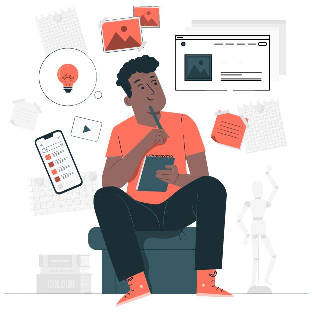
Before jumping on the trends of 2021, let’s take a look at the objectives to keep in mind for any year. These are some points you should consider before creating any website for better user experience.
1. Create More Defined Web Content
The website has multiple types of contents including text and images, graphics. Make sure the special elements stand out. These elements are the highlights of your website that the users are interested in.
If you are selling a product, the customers should not be confused about the price point or the USP of the product. The same is to be followed for any services you are selling. Use Multiple Drop Shadows, or a very subtle border around certain elements to make those elements appear a little sharper, more defined.
Choose a shade darker than usual for the shadows or borders of those elements to make them pop up. Remember to go through the design multiple times from a customer’s point of view. Use colors that are in contrast to create a clear vision and not a muddy one.
2. Avoid Using Multiple Typeface
This is a common mistake done by many in order to make the website look interesting. Remember that sometimes the beauty lies in simplicity. Choose a font that is easy to read for all. The visitors should never have to put much effort just to read what you have to say.
You can use the same font in different sizes and thickness or colour to make the website aesthetically pleasing. However, restrain yourself wherever possible. Using a combination of Weights, Sizes, and Color you can still produce perfectly acceptable results that are also sustainable in the long run.
3. Avoid Small Fonts for Texts
We all have been there! In order to put more than enough texts to make use of more keywords, we can end up using smaller fonts. Use at least 20pt to make the text visible. Smaller texts are harder to read and tiring for your visitors’ eyes. Especially, if you are presenting a long-form of content, like a blog.
Many companies are trying to sell their products and often the undesirable information is put at the bottom in fine texts. Isn’t it? You definitely do not want to be in that category. The viewers will always judge the content based on how easy it is to read as that would create reliability.
4. Consider the Users’ Onboarding Experience
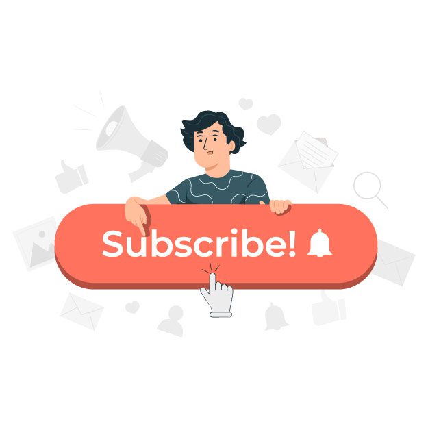
Newsletters are important to create a database but only the repeating customers would happily subscribe. Even a strong testimonial is not enough to convince everyone to subscribe at one go. Therefore, you must make it easy for them to skip the process swiftly. If it becomes nagging, chances are the visitor will quickly leave the website altogether.
Having said that, it is not enough to just consider the customers using a computer screen with a supporting mouse. A large percentage of your users are accessing the web through their mobile devices. Hence, using their thumbs. Enable users to skip your App Onboarding sequence at any time. Consider placing that Skip option within their easy thumb reach.
5. Keep Track of the Shadows
This is probably the most common UX/UI design mistake of all time. You have put shadows in all your highlights and icons but, are they in the same direction?
We live in the land with one sun, the primary source of light. So, no matter where you stand, the shadow of your every body part is supposed to fall in one direction. This same principle applies for your website. Make sure your shadows always come from just the one light source.
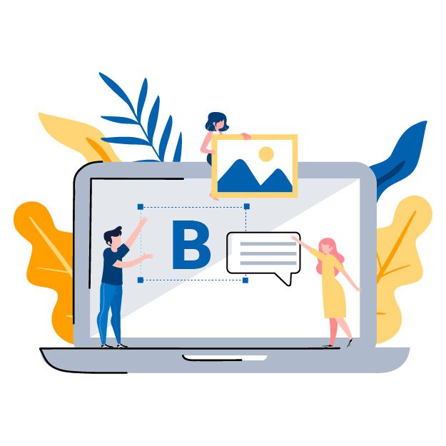
6. Contrast between Text and Images
There can be multiple spaces in your website using text on image depending on the design. No matter how speaking or bright the image is, the text will seal the deal. So use the image with a subtle, but simple Overlay. Consider the text to be the star of the area.
You can either opt for a tried, and tested full image overlay, or a more subtle gradient overlay to achieve a simple contrast between the two elements. Use contrasting colours and avoid an image that looks too busy for the text. Don’t be afraid to darken or lighten the text depending on the background. If the background is of darn color, maybe just a white text can do the wonder.
7. Use Whitespace Generously! Let the Design Breathe!
The Whitespace or Negative Space allows your design to breathe. Use it wisely and generously. Even just subtle amounts of the good white stuff can allow your designs to breathe, and look more polished. It is surely one of the fastest, and simplest ways to improve your designs.
We live in the land with one sun, the primary source of light. So, no matter where you stand, the shadow of your every body part is supposed to fall in one direction. This same principle applies for your website. Make sure your shadows always come from just the one light source.
8. Language of Ease
You may be the rightful contender of Shakespeare when it comes to literature or hire one to write for you. But not all your website visitors are looking for a literary firework. Keep it as simple as possible. People on the web don’t have all day to relish your web content. Use straightforward informative content that can grab the attention of people from any language background over the globe.

What are the latest UX/UI Design Trends of 2021?

Gone are the days of perfection in every curve! Being unique is the main attraction, even if it has a more rustic approach. The more rustic means the more connect with the users. The pandemic has shaken up everything and that is evident on the quality of graphics as well.
Incomplete, free-hand exotic web application design elements encourage the emotion of being like minded in your customers. They make websites unique and authentic regardless of how technically incorrect they look. Those unique shortcomings are your brand identity and the customers will love you for them. Having said that, do keep a general aesthetic in mind.
Create something new, unique, and inventively different to grip the attention of users and prove how exclusive your brand is. Give the customers a fair chance to connect with you in a more humane manner. Top to bottom perfection looks more robotic. Present a refreshing new take on the world of web design which has been dominated by pixel-perfect elements for so long.
Not the Netflix series! You probably have experienced the dark black background in the leading platforms like Instagram, Android or Apple. Why not incorporate that to your website?
The key reason for its success is that It is simply just modern, sleek, and sophisticated. The dark background allows you to even save battery power. It’s easier on the eye in low-light conditions. So even if you are not convinced about it being stylish, think about your customers’ eyesight.

This is not something revolutionary. You don’t have to provide your web visitors with any special glasses. Just use the existing AR and VR technologies in the design in the form of hyper-realistic 3D visuals. These elements have fascinated users for years and you must have been drawn to them as well at some point or the other.
These elements can however be heavy on the website server and make the website slow. So make sure that you have an exceptionally high-performance UI that is fast loading and well optimized. You might need the help of a professional to make it work.
The 3D elements help the UX/UI designers to make your website attractive. The key is to make sure it is flawless in terms of loading time, response time etc. The implementation of immersive 3D designs is definitely going to be the coolest trend of 2021.
A mixture of photographs with graphic images is also emerging rapidly. Overlapping graphics onto images or vice-versa allows the UX/UI designers to unleash their creativity. Use Bold fonts and colors to create an amalgamation of the different media. The result is always fabulous!
This design trend is immensely flexible and can produce multiple opportunities to create an unique design. Using multimedia also makes it look very DIY and hence, creates a better connection with the users. So create the best collage possible!
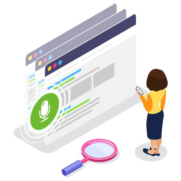
Using chatbots or voice assistants is not limited to just conduct searches anymore. With Siri, Alexa, Google Assistant etc. you get to book appointments, flights, play music, take notes, and much more. So why shouldn’t your website have one?
It adds a “human touch” to your virtual space. Implement a voice user interface (VUI) design and become a leader in your niche. It is a technology that has already become a hot topic due to the spread of coronavirus and the need of minimizing touch. So stand out from competitors by adding the trend into your UX/UI design in 2021 without a delay.
This goes without saying. The better images mean better visuals and in turn, a better user experience. No matter what industry you are in, use quality images that look absolutely stunning. Don’t compromise on resolution at any cost.
If you have an e-commerce site, don’t focus on how realistic the product image is. Remember to keep all it’s features correct but make sure to create a surreal touch to it. The idea is to lure in the customers just like the high-fashion industry does. Make your product look luxurious. Discuss with your UI designers and come up with an unique and attractive design for your site.
Tips: Use unusual futuristic color combinations to keep things bright and interesting.
Enough about the visuals! Let’s talk about the content of texts. Today’s users prefer to read and know about the company for any single product to have a better connection. They want to be a part of the popular brand, its history, and its uniqueness.
So, make your website texts more informal as users are bored with standard phrases. Create a conversation between the user’s mind and your UI. The trend is to keep things communicative and it’s definitely going to stick for longer.
Microcopies are another hot UX/UI design trend that combines with the UX writing. This technique adds a unique tone and sound to your website and allows you to build good relationships with users. The trend allows you to effectively capture the brand’s dialogue. Microcopy texts are developed specifically for a certain brand to support its corporate style.
The goal is to make it less formal and more like regular dialogue. Also, you can add a pinch of humor. Having said that, you should keep the humor within the limits and know the target audience you interact with. You don’t want to offend anyone! Try to keep things as positive as possible.
These trends will continue to ace this and the upcoming year’s UX/UI design scenario. These have been around for a while like 3D and futuristic designs, but there are also a few new things that will probably impact the world wide web. The key to success is to effortlessly incorporate the new trends along with the good old-fashioned ones to engage the maximum visitors. Bold fonts, 3D elements, realistic textures, and futuristic dark mode, abstract data visualization, and voice user interface – make sure to create an interface incorporating at least a few if not all.
If these feel overwhelming, Fret Not! A professional has both the experience and the expertise to help you come up with a modern and ground-breaking design to outran your competitors. We at Wisitech, approach with a 360degree solution for your every UX/UI needs. We expertise in creating a solution design that complements your brand outstandingly and help you to become a more prominent figure within your industry.