

In the early 2000s, businesses obsessed over getting online. A website itself was a competitive advantage. In the 2010s, the race shifted to mobile apps, responsive design, and social platforms. Each decade brought new digital touchpoints to manage, measure, and maintain.
As businesses approach 2026, one truth has become unavoidable: it no longer matters how many digital touchpoints a business owns. What matters is how easy those touchpoints are to use.
Customers now decide in seconds whether to stay on a website, book an appointment, or complete a purchase. If the experience feels slow, confusing, or unnecessarily complicated, they leave, often without a second thought. They don’t analyze why the experience felt frustrating. They simply move on to the next option.
This shift has quietly changed the role of user experience (UX). UX is no longer a design concern or a cosmetic upgrade. It has become a core part of running a business. When UX works well, it supports growth by making it easier for customers to take action. When it fails, it creates friction that marketing budgets, promotions, and even strong products struggle to overcome.
What many small businesses don’t realize is that poor UX rarely announces itself with obvious warning signs. It doesn’t trigger alarms or sudden crashes. Instead, it quietly erodes revenue, weakens brand perception, and gives competitors an advantage, often over months, not days. By the time the impact becomes visible, meaningful growth opportunities have already been lost.

Why customers have zero patience for bad UX
Customer expectations have changed faster than most small businesses realize. Today’s digital experience is shaped by speed, convenience, and continuity across devices. Anything that falls short feels immediately outdated.
The multi-device reality
The average consumer now uses more than 3 connected devices every day. A search might begin on a phone, continue on a laptop, and end with a booking or purchase on a tablet. Customers expect these transitions to feel effortless.
They do not think in terms of channels or platforms. They expect continuity. If a website works well on desktop but feels cluttered or difficult on mobile, trust breaks instantly. In most cases, customers do not try again on another device. They simply leave.
As mobile traffic dominates for most small businesses, mobile UI UX design services often deliver the fastest gains by removing friction from the screens customers use most.
The 1-second rule
Speed has become a baseline expectation, not a technical luxury. Even a 1-second delay in mobile page load time can reduce conversions. That single second often determines whether a customer stays or abandons the journey.
Small businesses feel this impact first. Larger brands can sometimes absorb inefficiencies through brand loyalty or scale. Smaller businesses rarely get that second chance.
5 digital experiences customers expect today
Modern customers expect digital experiences that are simple and direct:
- Pages that load quickly
- Navigation that feels obvious
- Clear choices without unnecessary steps
- Relevant recommendations or guidance
- Processes that respect their time
Customers compare every online experience to the best ones they use daily, whether they belong to global brands or not. A local bakery, law firm, or plumbing service is judged against the same standard of ease and clarity.
Digital experience is brand experience. Customers do not separate the two.
What poor UX actually costs your business beyond lost sales
The real cost of poor digital experience shows up quietly in daily operations and compounds over time. For many small businesses, UX issues drain revenue long before they are recognized as the cause.
More customer support calls
When customers cannot find basic information or complete simple actions, they reach out for help. Phone calls, emails, and messages increase, not because demand is higher, but because the website fails to do its job.
Teams spend time answering questions that should have been resolved through clear navigation, visible pricing, or simple forms. Support costs rise while conversions remain flat. The business becomes busier without becoming more profitable.
Lower marketing ROI
Poor UX weakens every marketing channel. Paid ads, SEO, and social traffic drive visitors to the site, but friction prevents them from taking action.
This creates a hidden waste problem. Businesses continue to increase ad spend to compensate for low conversions, unaware that the real issue lies with the website itself. Every marketing dollar produces less return, not because the audience is wrong, but because the experience blocks progress.
A weaker brand impression
Customers form opinions quickly. When a website feels slow, confusing, or outdated, it signals deeper problems. Many assume that if a business cannot deliver a smooth digital experience, it may cut corners elsewhere as well.
Trust erodes before a relationship even begins. The business may offer excellent service, but the digital experience never allows that strength to surface.
Reduced repeat business
Friction discourages loyalty. Customers who struggle to book, buy, or get answers rarely return. It is simply easier to choose a competitor next time.
This reduces customer lifetime value and forces the business to rely more on constant acquisition than on retention.
The hidden cost of customer acquisition
What many businesses miss is how UX affects acquisition economics. In online retail, UI UX services for ecommerce directly influence cart abandonment, checkout completion, and repeat purchases. Improving conversion rates does not just increase revenue. It lowers the cost of acquiring each customer.
If a business converts 1 percent of visitors and raises that to 2 percent through UX improvements, the same marketing spend now generates twice the number of customers. Customer acquisition cost is effectively cut in half.
This is the unlock. Better UX does not just improve performance. It changes the underlying math of growth.
How AI changed what “good enough” means
Artificial intelligence has quietly reset customer expectations. Tools like ChatGPT, Alexa, and Google now deliver instant answers, contextual suggestions, and clear next steps with minimal user effort.
As customers interact with these tools daily, they carry those expectations into every digital experience. What once felt acceptable now feels slow or unnecessarily complex.
Customers increasingly expect a website to help them move forward without friction. They expect simple questions to be answered without having to search through multiple pages. Most importantly, they expect fewer steps between intent and action.
This has created a widening gap between what customers experience elsewhere and what many small business websites still deliver. A customer can ask a single question to an AI tool and receive a direct response within seconds. Then they arrive at a business website that hides pricing, loads slowly, asks for excessive information, or forces multiple clicks just to book or inquire.
The contrast is immediate. Frustration builds quickly, even if the product or service itself is strong.
AI has not eliminated the need for good UX. It has made poor UX far more noticeable. Websites that function as static brochures now feel outdated because they do not respond to customer intent.
The result is simple but significant. When a digital experience does not meet this new baseline, customers leave.
UX improvements do not require a big budget. Here is how to start
One of the most common objections small businesses raise is cost. UX improvements often sound expensive, time-consuming, or tied to full website rebuilds. For many businesses operating on tight margins, that assumption becomes a reason to delay action altogether.
The reality is simpler. Most businesses do not need to redesign everything. They need to identify and fix the single point in the digital journey where customers are dropping off.
Focus on the biggest leak first
Every website has friction, but not all friction matters equally. The goal is not perfection. The goal is to stop losing customers unnecessarily.
A simple starting point requires no budget at all:
- Open Google Analytics and identify the highest traffic page that does not convert
- Open that page on a mobile device
- Attempt to complete the action a customer is expected to take
Where confusion, hesitation, or frustration appears, that is the starting point. The most valuable UX improvements usually sit on pages that already attract attention but fail to convert it into action.
Zero-cost fixes that often deliver the highest return
Some of the most effective UX improvements require only small changes:
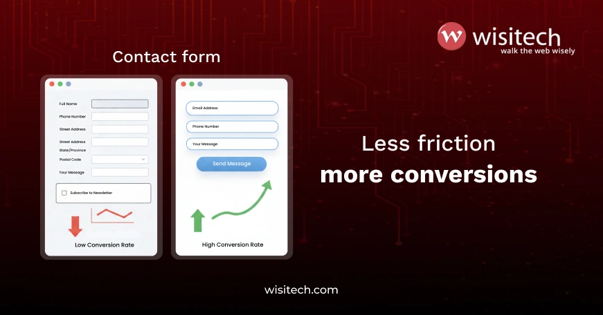
- Removing one unnecessary form field can reduce friction immediately and often increases submissions by 20 to 30 percent.
- Making a phone number visible in the mobile header helps capture customers who prefer calling over filling out forms.
- Compressing a slow-loading image can prevent visitors from leaving before the page finishes loading.
- Simplifying navigation by removing unnecessary menu items helps customers make decisions faster.
Each of these changes takes minutes, not months, and directly improves the customer experience.
When professional help makes sense
DIY platforms work when customers can complete actions easily, mobile performance is smooth, pages load in under 3 seconds, and conversion rates improve steadily.
The most effective UI UX design services for small businesses prioritize clarity, speed, and measurable outcomes rather than visual trends.
Professional help becomes valuable when traffic increases but conversions stall, when required features exceed platform limitations, when teams spend excessive time fighting templates, or when customers begin to complain about the digital experience.
The decision should be based on return, not cost. If improving UX converts even 3 additional customers per month, the value compounds quickly.
For example, 3 new customers per month at an average value of $500 equals $18,000 annually. In many cases, a modest UX investment pays for itself within a few months.
The metrics that prove UX improvements are driving business results
One of the most common questions businesses ask before investing in UX improvements is simple: how will this be measured? This is where UX stops being subjective and becomes operational.
Good UX decisions are validated through data. Without clear measurement, improvements feel cosmetic, and results remain unclear.
Establish a baseline before making changes
Before changing anything, businesses should capture a clear baseline. 4 metrics provide the most reliable signal of UX performance:
- Conversion rate
This measures how many visitors complete a meaningful action such as booking a service, submitting a form, or making a purchase. This is the primary indicator of UX effectiveness and should be tracked overall and by traffic source. - Bounce rate on key pages
High bounce rates on pages like the homepage, services pages, or contact page signal confusion, slow loading, or misaligned intent. Comparing mobile and desktop bounce rates often reveals where friction is concentrated. - Time to complete an action
The longer it takes a customer to book, buy, or submit a form, the more likely they are to abandon the process. Longer completion times usually point to unnecessary steps or unclear instructions. - Mobile versus desktop conversion gap
Most traffic is now mobile. When desktop conversion rates significantly outperform mobile, it almost always indicates a mobile UX issue rather than a marketing problem. - Make one change at a time
Measurement only works when changes are controlled. Making multiple UX changes at once makes it impossible to determine which, if any, improved performance.
The most effective approach is to identify one friction point, fix it, and observe the impact over a 30-day period.
The value of this approach is twofold. It proves ROI using the business’s own data, not industry averages. It also builds confidence for the next improvement.
Tools that support UX measurement
Most businesses already have access to the tools they need.
- Google Analytics (GA4) tracks conversion rates, traffic sources, and device performance.
- Google PageSpeed Insights identifies loading issues and mobile performance gaps.
- Hotjar or Microsoft Clarity reveal where users hesitate, scroll, or abandon tasks.
30 day UX check
After any UX change, compare conversion rate, bounce rate on affected pages, time to complete the action, and the mobile desktop gap. If results improve, continue. If not, adjust and test again.
The 3 mistakes that sabotage UX
Even businesses that understand the importance of UX often undermine their own efforts. The issue is rarely lack of intent. It is usually a set of common assumptions that lead teams in the wrong direction.
Mistake 1: Confusing visual design with usability
Many businesses believe their UX problem stems from an outdated website. As a result, they prioritize visual redesigns over functional improvements.
In practice, data often tells a different story. High mobile bounce rates typically indicate slow load times. Abandoned checkouts and forms usually indicate excessive steps or unclear instructions. High traffic with low engagement often signals that calls to action are not obvious.
A visually appealing website that loads slowly or forces customers to think too much will not perform well. A simple website that loads quickly and guides users clearly will.
The fix starts with analysis, not aesthetics. Businesses should identify where customers drop off before deciding how the site should look.
Mistake 2: Adding features instead of removing friction
Another common pattern is feature overload. Businesses see competitors using chatbots, animations, sliders, or interactive tools and assume they need the same additions to stay competitive.
The better question is always what problem a feature is meant to solve. Many features increase complexity without improving outcomes. They slow down pages, introduce maintenance overhead, and distract customers from taking action.
In many cases, a basic solution performs better. A clear FAQ section can replace a chatbot. A visible phone number can outperform live chat. Fewer choices often lead to faster decisions.
Strong UX rarely feels impressive. It feels effortless because it removes obstacles rather than adding layers.
Mistake 3: Treating UX as a one-time project
Some businesses approach UX as a task to be completed during a website launch or redesign. Once the site goes live, attention shifts elsewhere for years.
Customer behavior does not stand still. Expectations rise as people interact with better digital experiences elsewhere. Mobile usage patterns change. New devices and screen sizes emerge. What worked 18 months ago may no longer feel intuitive.
Effective UX is an ongoing practice. Businesses that perform best review conversion metrics regularly, monitor page speed as content grows, and adjust forms and navigation based on real usage patterns.
UX is not just your website. It is the entire customer journey

UX extends far beyond individual pages or visual layouts. It includes every digital interaction a customer has with a business, from initial discovery through repeat engagement.
UX determines how easily they can compare options and build confidence. Clear pricing, visible trust signals, and straightforward explanations reduce hesitation. When comparison feels difficult or when information is buried, doubt grows.
Taking action is often where UX succeeds or fails most visibly. Booking a service, requesting a quote, or completing a purchase should feel simple and predictable. Each additional step, field, or decision point increases the chance of abandonment.
The journey does not end after the transaction. Confirmation messages, next steps, and follow-up communication all shape how customers feel about their decision. When returning or reordering is easy, repeat business becomes more likely.
When this full journey feels smooth, businesses see steady growth. Customer acquisition becomes more efficient, repeat purchases increase, and support demands decrease. When friction exists at any point, growth slows, even if marketing investment continues to rise.
Strong UX aligns the entire digital journey around one goal: making it easy for customers to move forward with confidence.
3 diagnostic questions to identify where UX is failing
Identifying UX problems does not require specialized tools or technical expertise. In many cases, the biggest issues become clear by answering a few focused questions honestly.
Question 1: Is the website built around customer needs or internal structure?
A common UX failure occurs when websites mirror how a business is organized internally rather than how customers think.
The simplest test is speed of understanding. A first time visitor should be able to find the most relevant service or product within 2 clicks. If this requires navigating through department names, internal terminology, or layered menus, the structure is working against the customer.
For example, customers rarely look for sections labeled sales, operations, or support. They look for actions such as get a quote, book a service, track an order, or get help. Organizing content around customer intent reduces confusion and shortens the path to action.
Question 2: Are the right metrics being measured?
Many businesses focus on traffic growth and engagement numbers while overlooking the outcomes that actually drive revenue.
The most meaningful metrics are bookings, purchases, form submissions, phone calls, and repeat visits. These indicators show whether customers are able to complete the journey successfully.
A smaller audience with higher conversion often outperforms a larger audience with poor UX. 500 visitors converting at 3%generate more business than 1,000visitors converting at 1%. UX quality determines which scenario occurs.
Question 3: Is technology simplifying the journey or adding friction?
Automation and AI can improve UX, but only when they reduce effort for the customer.
Good use of technology fills in known information, guides users toward relevant options, and answers simple questions quickly. Poor use forces interaction when it is not needed, adds steps to personalize experiences, or creates uncertainty about what to do next.
If a chatbot blocks access to a phone number or if automation replaces clarity with complexity, UX suffers.
The guiding principle is simple. Technology should remove steps, not introduce them. When clarity improves, conversions usually follow.
A 30 day UX improvement plan
Improving UX does not require a long roadmap or a full redesign. What it requires is focus, discipline, and measurement. A structured 30 day plan helps businesses move from insight to impact without overwhelming teams or budgets.
Week 1: Audit and identify
The first step is to identify the single biggest issue limiting conversions.
- Run a page speed test using Google PageSpeed Insights.
- Review Google Analytics to find pages with high traffic and low conversion.
- Open key pages on a mobile device and attempt to complete the primary action.
The goal is not to list every problem. The goal is to find the one issue most likely costing customers.
Week 2: Fix the biggest issue
Once the main problem is clear, implement 1 improvement.
If pages load slowly, compress images and remove unnecessary scripts or plugins. If navigation is confusing, simplify menus and make calls to action more visible. If forms cause drop off, remove unnecessary fields and clarify instructions.
Keep changes focused and intentional. Solving one real problem delivers more value than making several superficial updates.
Week 3: Measure the impact
After changes go live, compare results against the original baseline.
Review changes in conversion rates, bounce rates on affected pages, time to complete actions, and the gap between mobile and desktop performance. Improvement in these metrics confirms that the UX change is working.
If results do not improve, adjust the approach rather than expanding the scope.
Week 4: Plan the next fix
UX improvement compounds over time. If the first change produces results, identify the next highest impact issue and repeat the process. If results are neutral, test a different solution to the same problem.
Small improvements often create meaningful gains in bookings, sales, and customer satisfaction. Businesses that focus on ease and clarity consistently outperform those that prioritize visual complexity.
The fastest-growing businesses do not rely on flashy digital experiences. They focus on removing friction and making it easy for customers to take the next step.
Great UX makes it easier for customers to choose you
Whether through mobile optimization, conversion analysis, or targeted UI UX design services for small businesses, the goal remains the same: make it easier for customers to move forward. Businesses that treat UX as an ongoing practice rather than a one-time project create a competitive advantage that compounds over time. They acquire customers more efficiently, retain them longer, and reduce operational friction across teams.
The businesses that grow fastest will not be the ones with the flashiest websites or the most features. They will be the ones who respect the customer’s time and make every digital interaction feel straightforward and predictable.
Not sure where your website is losing customers?
At Wisitech, we help small businesses identify the exact friction points hurting conversions and fix them with focused, data-backed UX improvement.
We approach UX as a growth discipline, not a design exercise. The focus is on identifying where customers hesitate, drop off, or abandon actions, then fixing those friction points using data, not assumptions.
By combining user behavior analysis, conversion tracking, and practical optimization, we help small and mid-sized businesses improve conversions, reduce acquisition costs, and create digital journeys that feel clear, fast, and intuitive.